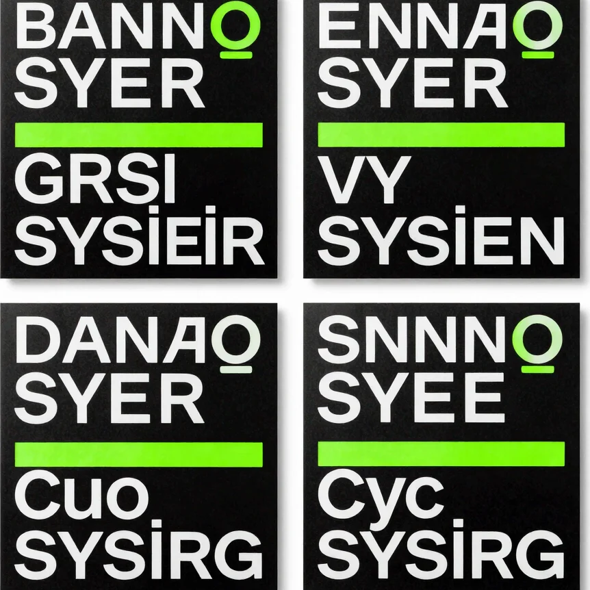
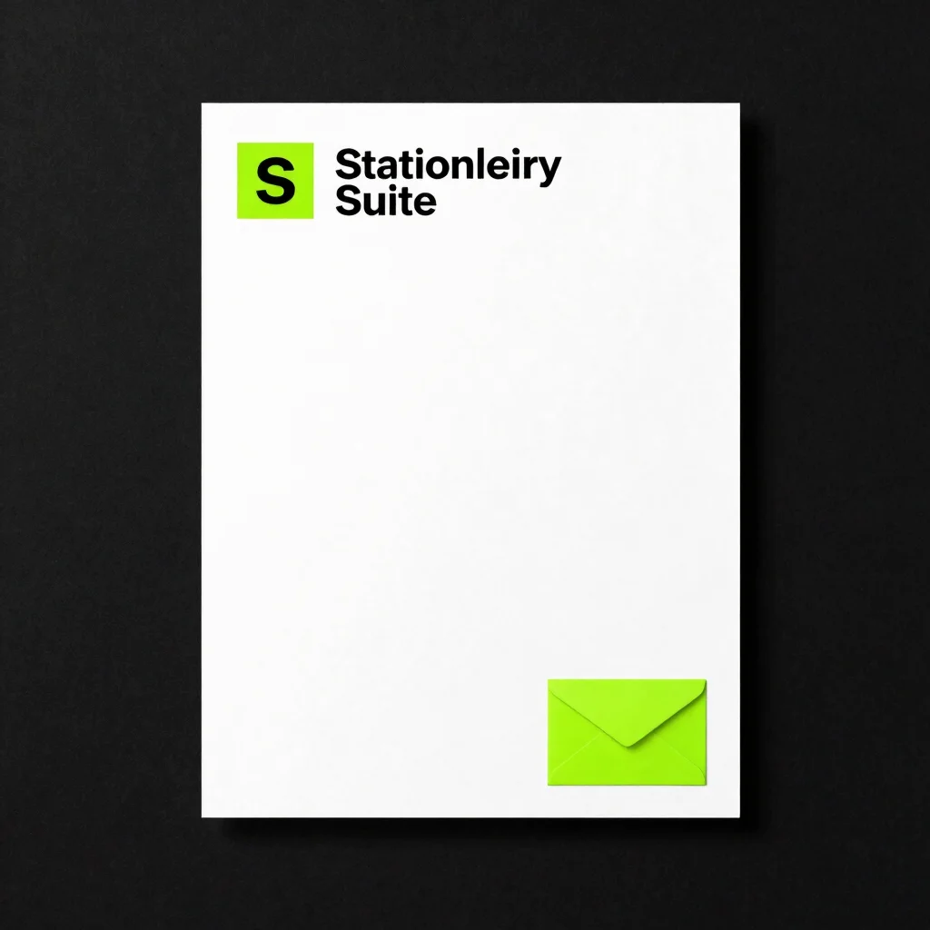
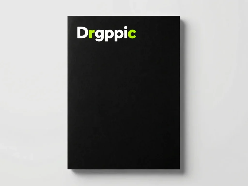
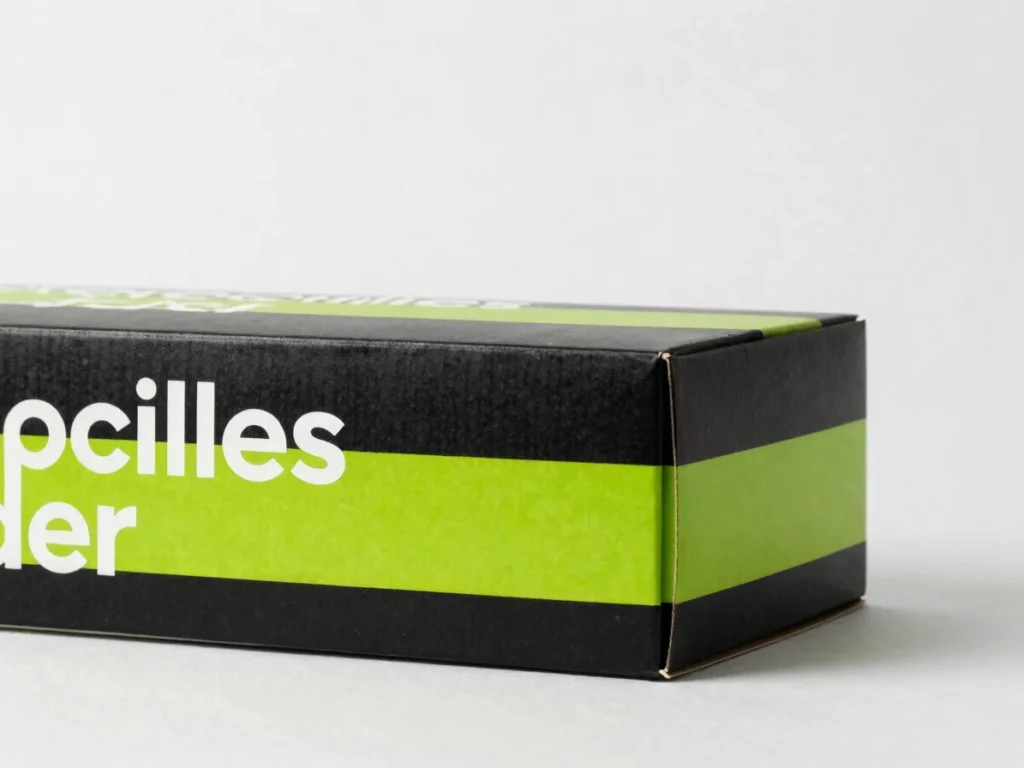
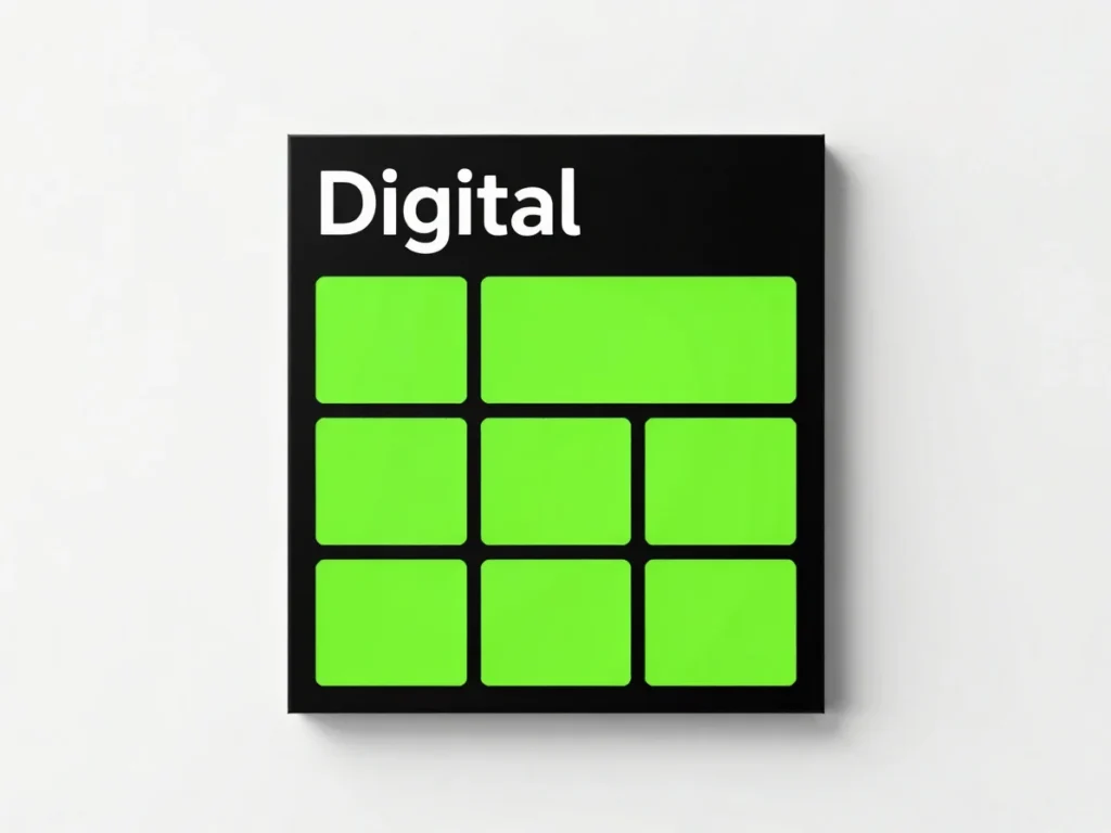
Identity marks, typography systems, and applications shown in clean, straight-on views.
Goals and direction
The thinking behind each identity
Identity system
Clarity-first mark
The goal was a mark that reads instantly at small sizes. I kept the form reduced to a single geometric shape, paired with a neon green accent that signals energy without crowding the layout.
Print and packaging
Structured typography
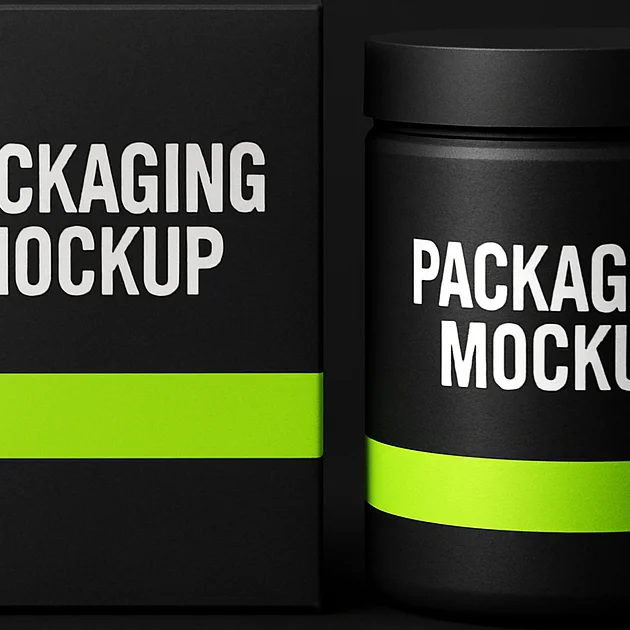
The direction centred on a strict type hierarchy so the brand could carry across print and packaging. Black surfaces hold white type, and neon green is reserved for the single key detail on each piece.
Digital application
Flexible brand board
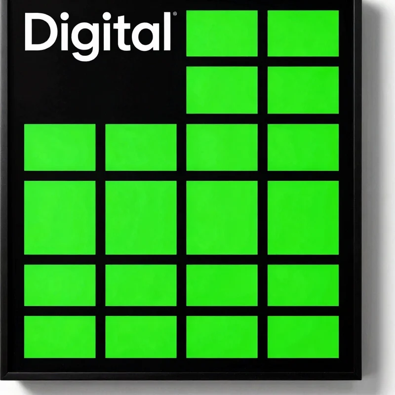
The goal was a system flexible enough for screens and social formats. The board pairs a white wordmark with a restrained colour set, keeping every element legible at a glance.
Have a brand that needs a clear identity?
I take on a small number of branding projects at a time. Get in touch to discuss your goals.